


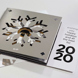

The Key to Sustainability: Less Is More
Discover how GSP is redefining sustainability by focusing on material reduction — a powerful yet often overlooked strategy for a greener future.
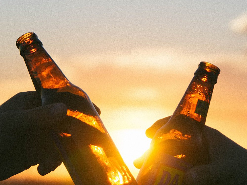
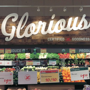
3 Ideas to Drive Your Summer Beer Sales Into Fall
Summer is the ideal time to drive traffic to your convenience store or supermarket beer displays. Here are three cost-effective signage ideas sure to capture your beer customers’ attention and generate repeat business all summer long.
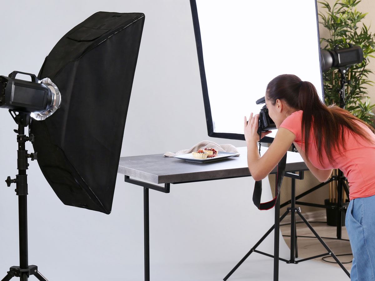
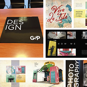
Food Photography Photo Shoots From Start to Finish – Part 3
One of the most critical stages of any photo shoot is planning what you want your photographs to look like. There are several ingredients that go into this very important step.