Color is Significant Sales Driver
Color is the Most Important Factor for POP and Shelf Impact
 Studies show that it takes about five seconds to locate and select a given product, which occurs when it is visible to the passing shopper. Color enhances on-shelf visibility since it is the mechanism that places emphasis on certain areas. The same holds true for point-of-purchase (POP) signage.
Choosing the right colors is the most important step in graphic design for retail products and POP promotions. The appropriate use of color can also increase brand recognition by 80%, and brand recognition directly links to consumer confidence.
Consider the phenomenal success of Heinz EZ Squirt Blastin' Green ketchup. More than 10 million bottles were sold in the first seven months following its introduction, resulting in $23 million in sales - the highest sales increase in the brand's history. All because of a simple color change.
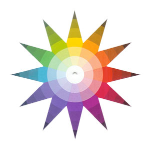
The human eye and brain experience color physically, mentally and emotionally. As a result, colors themselves have meaning. Color symbolism is often a cultural agreement and opinions about the associations are varied and sometimes conflicting.
Red represents passion, enthusiasm, excitement, heat and anger. It suggests speed, action and stimulates heart rate, breathing and appetite. Red cars are stolen most often. Yellow is associated with caution, wisdom, optimism and radiance. Pale yellow can enhance concentration (used for legal pads). Blue represents knowledge, contemplation as well as detachment. Blue causes the body to produce calming chemicals and is relaxing. Green represents money, growth, healing, nature and also greed, envy and nausea.
Purple is associated with luxury, imagination, sophistication, rank, inspiration, nobility as well as madness and cruelty. Orange represents creativity, stimulation, health, whimsy and trendiness. Orange rooms speak of friendliness and fun, and get people thinking and talking. Black is associated with power, sophistication, solitude, mystery, fear, mourning and remorse. White is associated with light and purity. It represents cleanliness, sacredness, simplicity, truth and marriage.
The gender of the intended audience is also an important factor to consider when choosing colors. According to various studies over the years, women can discern more difference in colors than men, are more flexible and diverse in their color preferences, prefer soft colors and are more likely than men to have a favorite color. Men prefer bright colors but are also more tolerant of achromatic colors (colors with zero saturation - grays, white or black).
The cultural significance of certain colors is also a consideration in design. For instance, red represents masculinity in France and the color of mourning in South Africa. In Latin America, purple indicates death while in Japan represents enlightenment.
A lot to keep in mind when choosing a color palette for a product packaging design project or a POP display.
Most designers seek a color scheme that engages the viewer and provides a balanced visual experience. But the starting point for all color selection should be what combination of colors will best convey the desired meaning and audience? If those colors are clichéd and overused, what are the best alternatives? Can the effect be refined by a slight modification of color choice?
According to the Color Design Workbook by Adams Morioka and Terry Stone there are eight rules for building a color palette:
1. Figure out the purpose
2. Review color basics, meanings and associations
3. Choose a dominant color, then accent colors
4. Select shades, then vary them
5. Look at compatibility of hues
6. Limit the number of colors
7. Put the colors in action
8. Keep a logbook of color palettes that work
The great 19th-century writer and critic John Ruskin once said, "Color is the most sacred element in all visual things.” Color stimulates and works synergistically with all of the senses, symbolizes abstract concepts and thoughts, and produces an aesthetic or emotional response.
Whether we realize it or not, color affects our decision-making process and can lower our sales resistance.
When frozen foods first appeared, they were packaged in ice-green or snow-blue containers with pictures
of arctic images. They didn't attract the eye of the average consumer, until they were re-packaged in warmer colors that suggested the appetizing appearance of the re-heated food. Colors should effectively represent the product’s intended positive outcome or feeling after using or consuming the product. That
will elicit the positive emotional response necessary to drive sales.
 Color also has the unique ability to attract specific types of shoppers and change shopping behavior. Red, orange, black and royal blue attract impulse shoppers. Navy blue and teal attract shoppers on a budget and pink and sky blue attract traditional buyers.
In the retail world, with the essential need to engage the customer, we must embrace the power of color to help us enhance brand awareness, product selection and ultimately drive sales. Source: KISSmetrics
