Effective POP Design
Part 2 of 2: Product and Shape
Part one of this series outlined the challenge that an effective sign must meet to drive sales: it must capture the consumers attention quickly while clearly communicating the retailers offering. Designers achieve a balance between these two priorities by leveraging the basic elements of POP design: typeface, color, product image, copy and shape.
SEE:
Effective POP Design -
Part 1 of 2: Typography and Color
In part two of this series, we explore how top designers leverage product images and shape to create effective signs.
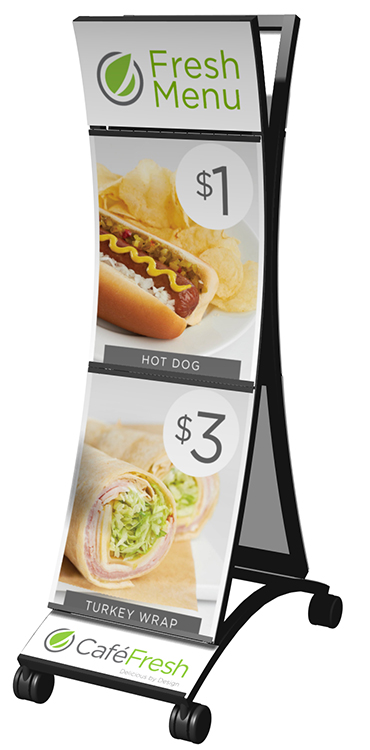
PRODUCT
Graphics should be designed to showcase the product or products being sold as the hero element of the sign. The graphic or photographic treatment of the image should highlight the benefits of the product: for example, fountain drinks should look cold to suggest cool refreshment and hot food images should be styled to show the mouth-watering ingredients. To do that, its important to incorporate a high-resolution well photographed and styled image of the product — one that will work well for large format graphics and signage.
Not every product image can be translated onto every sign, so keep it simple and remember to maintain white space. An industry guideline is 30-40% of the sign area should be blank or resting space. Too much clutter distracts potential customers and the message gets lost.
SHAPE
The overall shape of a sign can play an important role in its effectiveness. Signs in non-rectangular, unique shapes often grab more attention than a traditional rectangular sign.
Leverage shape in POP by using contour cuts to highlight the product: for example, cut a sign for a fountain promotion in the shape of a fountain cup. Retailers can also leverage shapes to reinforce their brand. McDonalds, for example, will often shape their window graphics as arches playing on the golden arches identity that they have built, and Target will often incorporate a round target shape into the signs throughout their aisles.
If the specialty cutting and fabrication required to create shapes is too costly, retailers can fake the shape by using a combination of clear stock and printed graphics to create the illusion of a countour-cut graphic.
Remember to utilize these key elements for effective point of purchase signage design... incorporate the right typeface and message, the right use of color, make the product the hero and utilize unique contour-cut shapes. Youll capture your customers attention, entice them to try something new, and see improved results from your in-store marketing efforts.
Heineken POP Display Wins Design Award Contact Us Today!
References
Graphic Design Referenced by Bryony Gomez-Palacio and Armin Vit
 GSP POP Signs Sell Infographic GSP POP Signs Sell Infographic
|