Effective POP Design
Part 1 of 2: Typography and Color
An effective sign must meet two challenges: it should capture the consumers attention and it should clearly communicate the offering. Designers achieve a balance between these two priorities by leveraging the basic elements of POP design: typography, color, product image and shape.
In this two-part article, we explore how top designers leverage these basic elements of POP design to develop signs that sell:
TYPOGRAPHY
Visibility, legibility and readability are three main considerations when choosing the right typography and message for a point of purchase graphic or sign.
First, choose a bold typeface style that is easily legible and has sufficient spacing between letters. Sans serif fonts and open styles such as Verdana tend to be more legible. You should work with a lettering style that works visually, yet still affords prime readability. Avoid thin or fancy script lettering as they decrease visibility - especially when signs or banners must be read from a distance.
When designing your sign, consider how far away the readers will be. For example, if you are placing a sign inside your store, your text only needs to be visible to the people in the store. 1-2 letters will work. However, if you are hanging banners and want drivers on a nearby highway to be able to see them, design your letters at 3 or even larger. Your sign's size will also determine the height of the lettering you should use. A good rule of thumb is every 1 inch of letter height provides 10 feet of readability with the best impact.
For readability, less is better keep copy short and clear. For best results to engage the customer, use a "call to action" that is readable and understandable at a glance.
COLOR
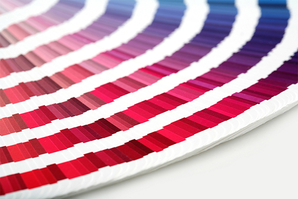
Choosing the right colors will not only help get your POP noticed, it can also help you set the tone or support an established company message. Use colors that are in your companys logo, product's logo or colors that will increase the eye-catchability of your sign. 85% of shoppers place color as a primary reason for why they buy a particular product.
A high color-contrast factor will make your signage easier to read, and there are
certain color combinations that are more legible than others. The most easily read combinations are black on yellow, white on black or yellow on black. Other effective color combinations are black or blue on white, and white on blue. Backgrounds and lettering with similar color intensities are not necessarily good choices, as they lack adequate contrast. Similarly, a too-bright background with colored lettering gives an illusion of motion
or vibration.
Color also has the unique ability to attract specific types of shoppers and change shopping behavior. Red, orange, black and royal blue attract impulse shoppers. Navy blue and teal attract shoppers on a budget and pink and sky blue attract traditional buyers. Yellow is an attention-getter, black represents power,
and green is positive and calming.
Also, its important to note that 8% of US males are color-blind. Use color combinations that retain contrast when viewed by color-blind people. Blue and yellow, for example, are a good combination, but blue-green or aqua on white or gray are difficult combinations for a color blind person to read.
SEE ALSO:
Color is Significant Sales Driver
GSP provides design services for many leading retailers. Click here to see how our Design Services team can help bring your retail vision to life
from concept to store-level execution.
References
 KISSmetrics Color Infographic: How do Colors Affect Purchases? KISSmetrics Color Infographic: How do Colors Affect Purchases?
GSP POP Signs Sell Infographic
Graphic Design Referenced by Bryony Gomez-Palacio and Armin Vit
Color Design Workbook by Adams Morioka and Terry Stone
|