Retailer Focus: M Local
Expanding English Food Retailer Focusing on Convenience and Fresh
 M Local, the new convenience offering by the UK supermarket chain Morrisons, has
five current locations, with plans to open 70 more by the end of 2013.
M Local, the new convenience offering by the UK supermarket chain Morrisons, has
five current locations, with plans to open 70 more by the end of 2013.
The first 3,000 square foot M Local store was launched last year in West Yorkshire. The intent of the new store concept was to address recent research that show UK shoppers are regularly disappointed in the freshness, range and price of convenience store products by focusing on affordable fresh food.
Their goal has been to create a retail proposition and expression that positions M local as Daily Market Fresh. This greater emphasis on fresh food, with the same competitive prices that can be found at the local Morrisons supermarkets, has been M-locals main ingredient for success in the UK market. Perishable goods such as fish, produce and breads are supplied from nearby Morrisons supermarkets four times a day to ensure freshness.
 The M local name itself establishes a strong link to the Morrisons parent brand,
while evoking a more neighborhood-focused store. The new visual identity retains
the design equity of Morrisons green and yellow, with a focus on the color green
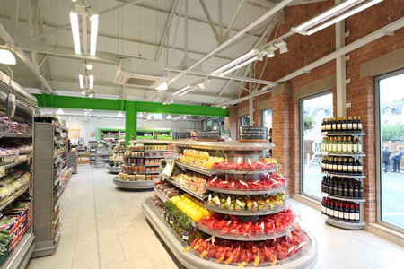
throughout the store to signify fresh. The interior design incorporates a unique
mix of tile-work, exposed architecture and natural materials such as wood and wicker.
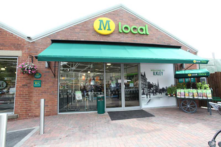
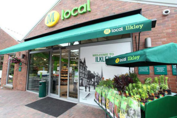
The signage utilizes a simple clear copy style to communicate the offerings. On
the front of the store, a large graphic is used to welcome the customers.
The M local name itself establishes a strong link to the Morrisons parent brand,
while evoking a more neighborhood-focused store. The new visual identity retains
the design equity of Morrisons green and yellow, with a focus on the color green
throughout the store to signify fresh. The interior design incorporates a unique
mix of tile-work, exposed architecture and natural materials such as wood and wicker.
The signage utilizes a simple clear copy style to communicate the offerings. On
the front of the store, a large graphic is used to welcome the customers.
 Morrisons is already a brand with a strong commitment to high quality and fresh
food. M local demonstrates this promise to customers and was highly commended in
the 2011 International Convenience Retailer of the Year Award for its innovation
with fresh food as the center of its convenience offer.
Morrisons is already a brand with a strong commitment to high quality and fresh
food. M local demonstrates this promise to customers and was highly commended in
the 2011 International Convenience Retailer of the Year Award for its innovation
with fresh food as the center of its convenience offer.
Key lessons from M Local:
- Large impactful signage with simple yet effective copy; subtle use of green to represent
fresh
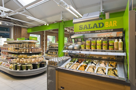
- Large assortment of fresh fruit, vegetables, meat, fish and bakery items
- Fresh food is prepared at the local full-format Morrisons stores and trucked in
several times a day to ensure freshness
- A new approach to fresh food pricing: there is no price premium on fresh products
A successful food retailer that has refined convenience with fast, affordable and
extremely fresh offerings for meals on the go, M Local has found the right ingredients
to stand out in the fast growing highly-competitive convenience retail marketplace.
